After a successful few years, we thought it was time for a rebrand
1st June 2022
After a very successful few years and a rapidly growing client base, we felt it was time for a change. Reviewing our current position in the market and recently completed projects, we felt there was inconsistency in our branding.
The Andrew Hindes Interiors team wanted a brand that truly reflected our projects and specialisms while positioning us more appropriately in the market. As a result, we decided it was time for a new brand, website, and stationery.
With experience in bathroom and tiling industries, we knew a rebrand wasn’t our area of expertise! Having worked with local creative agency m360 on our original branding, we felt it was only fitting they designed our new brand and desired collateral. With 30+ years of creativity under their belt and a talented studio of designers and developers, along with a second-to-none client service team, we knew we were in good hands.
We collaborated with m360 to create and develop our brand look and feel. This made it easy to design and develop a new brand representative of the minimalistic approach and muted colours often seen in our bathroom and tiling projects. Lifting the brand image to a level of high-end, tasteful understatement.
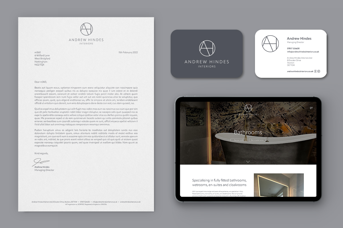
Moving forward with this style, we began refreshing the Andrew Hindes Interiors website and stationery.
Beginning with the website the aim was to highlight our range of services and knowledge to potential clients, whilst showcasing completed projects. Whilst providing visitors with information our website conveys the breadth of possibilities Andrew Hindes Interiors clients can have. The new website features an extensive portfolio, explanations of working processes, customer testimonials, and links to our social media channels.
Whilst the website was being designed and developed, a stationery suite was being produced. The stationery suite meets our team and business needs and includes business cards, a digital letterhead, and an email signature. To stand out from competitors our business cards feature a clean and smart refreshed branding on a grey matt background, finished with rounded edges.
We are extremely proud of our new branding, website, and stationery and we hope you do too!


